Role: Product Design & Technology Lead
Company: The Educational Company of Ireland (Edco)
Focus: UI Design System, Code Refactor, Process Optimization, HTML5 Implementation
Timeline: 2022–2024
Team: 1 Senior Product Designer (me), 2 Developers, 3 Animators, 1 Junior Editor, 1 Project Manager, External Illustrators & Audio Studios
Context
Bua na Cainte is an award-winning, fully interactive Irish-language learning programme used in primary schools across Ireland for over 10 years. Originally built in Adobe Flash and distributed on CDs, the platform was transitioning to a modern web-based HTML5 solution when I joined the team.
I was brought in to lead the design and technical modernization of the platform — transforming a legacy, fragmented system into a scalable, maintainable digital learning suite for students and teachers nationwide.
The Problem
When I joined during the development of Bua 6 (the final book in the legacy series), the platform faced critical challenges:
1. Outdated Visual Language
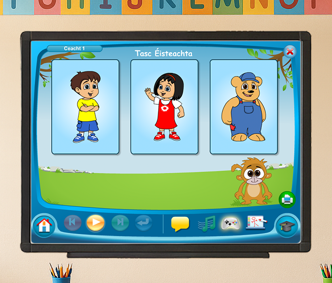
- The interface used a rigid CRT-style TV frame that meant nothing to modern children
- The design was visually cramped, limiting usable space for learning content
- The aesthetic felt like outdated software, not an engaging learning environment
2. Fragmented Codebase & Chaotic Workflow
- Games were built individually in Adobe Animate, then embedded as standalone HTML files with no shared UI components
- Code was riddled with duplication, inline styles, and commented-out legacy fragments
- Files were managed via Dropbox and FTP — no version control
- Game scripts were manually split from Word documents and distributed to developers
- It was impossible to track who was working on what, measure performance, or identify bottlenecks
3. Inefficient Production Pipeline
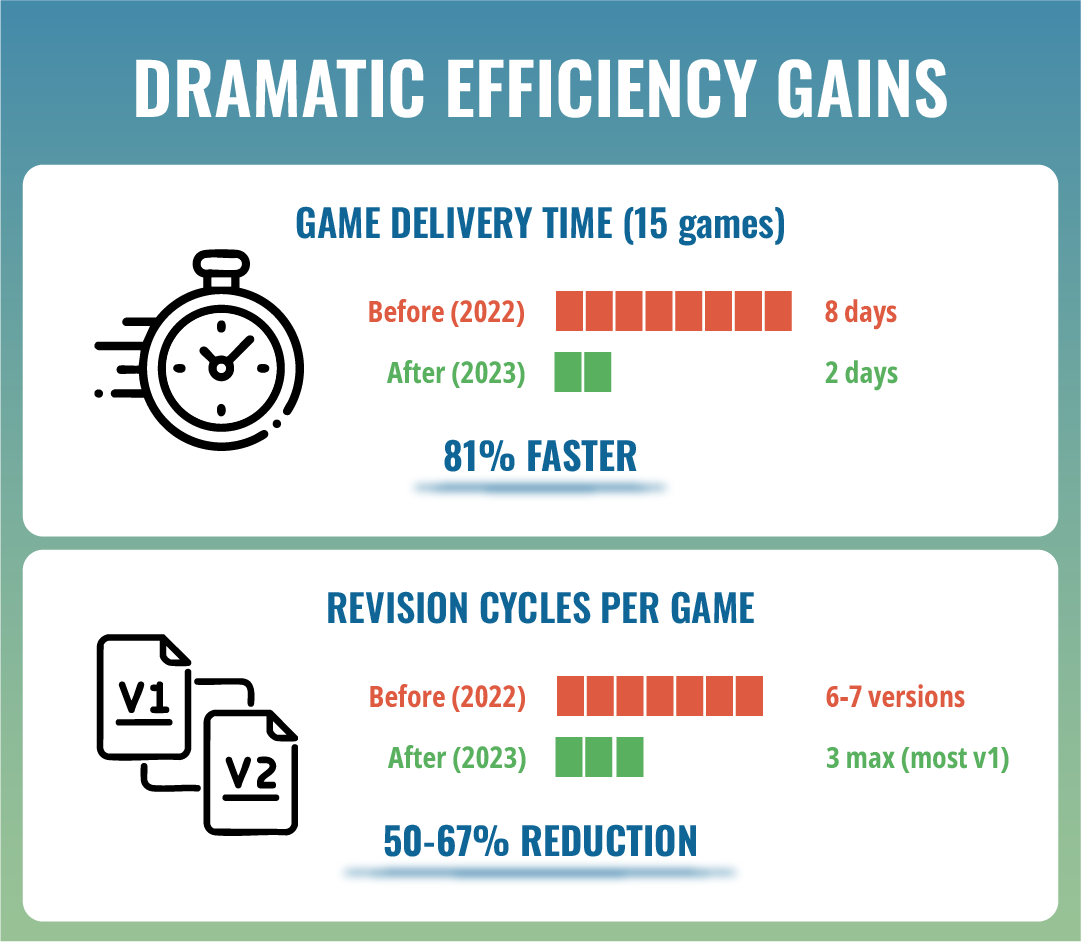
- 8 days to deliver 15 games with a team of 4 (1 full-time dev, 2 part-time devs, and myself)
- Games went through 6–7 rounds of revisions due to errors and inconsistencies
- The legacy CD-based delivery model required manual updates at schools, causing constant support issues
Constraints
- Curriculum Dependency: All game content, animations, and some UI elements had to align with the physical student books — already in production or printed
- No Direct User Access: We couldn't conduct user testing with students; validation came indirectly through teacher feedback and 10+ years of historical data
- Mid-Production Redesign: The rebrand for Bua A was approved 10% into production, requiring us to pause, redesign, and adapt existing work with minimal rework
- 4:3 IWB Format: All screens had to remain compatible with existing Interactive Whiteboard hardware used in classrooms
- Bright, Open Colors Only: Children's cognitive responses required avoiding muted tones (pale orange reads as white; almost-yellow breaks the experience)
Goals & Success Criteria
Business Goals
- Modernize the platform to reduce production time and technical debt
- Create a scalable design system for future books (Bua A and beyond)
- Eliminate CD distribution issues and enable real-time updates via web delivery
User Experience Goals
- Increase usable content area without changing screen dimensions
- Create a playful, game-inspired interface that feels inviting, not tool-like
- Improve navigation clarity for both students and teachers
Success Metrics
- Reduce game delivery time from 8 days to under 3 days for 15 games
- Cut revision cycles from 6–7 versions to a maximum of 3
- Increase usable screen space by at least 10%
- Achieve positive market reception for the rebrand (Bua A)
My Role & Collaboration
As the Product Design Manager, I was responsible for:
- UI/UX Design: Designed the full design system in Figma (buttons, menus, layouts, dialogue boxes) aligned with pedagogical flow and accessibility standards
- Front-End Implementation: Coded screens in HTML/CSS, refactored legacy code, and optimized performance
- Process Architecture: Migrated the team from Dropbox/FTP to Git, implemented Jira for task management, and structured the workflow to track performance and reduce errors
- Game Developer: Made games using templates in Animate or HTML, updating images, audios, animations and code
- Cross-Functional Bridge: Acted as translator between stakeholders (book authors, CEO, teachers, project manager) and the technical team (developers, animators)
- Asset Adaptation: Cleaned up and optimized vector illustrations from external illustrators, resized and restructured SVGs for responsiveness
- Multimedia Editing: Edited animations, audio, and video when needed to maintain production speed
I collaborated closely with:
- Stakeholders: Book authors, CEO, project manager/book editor, teacher-testers
- Production Team: 2 developers, 3 animators, 1 junior editor
- External Partners: Illustrators and audio studios
Process
1. Research & Insights (Empathize + Define)
While I didn't have direct access to students, I leveraged 10+ years of historical feedback from teachers and customer service reports. Key insights:
- Legacy CD versions caused constant support issues (compatibility, updates, installation)
- The TV frame was visually meaningless to children, they don't recognize CRT televisions
- Color variation drives attention and engagement in young learners
- Screen space was a bottleneck, many game titles had to be cut or reduced to fit
I also conducted visual research by analyzing modern kids' platforms (Netflix Kids, PlayStation UI, web game portals, TV shows) to understand current design patterns children recognize and enjoy.
Early Win: From my first interview, I noticed the outdated TV frame and pitched the idea of removing it to gain more usable space. It took one year to convince stakeholders, but the argument was clear: children don't relate to CRT TVs, and we were sacrificing valuable learning space for decorative nostalgia.
2. Ideation & Design (Ideate + Prototype)
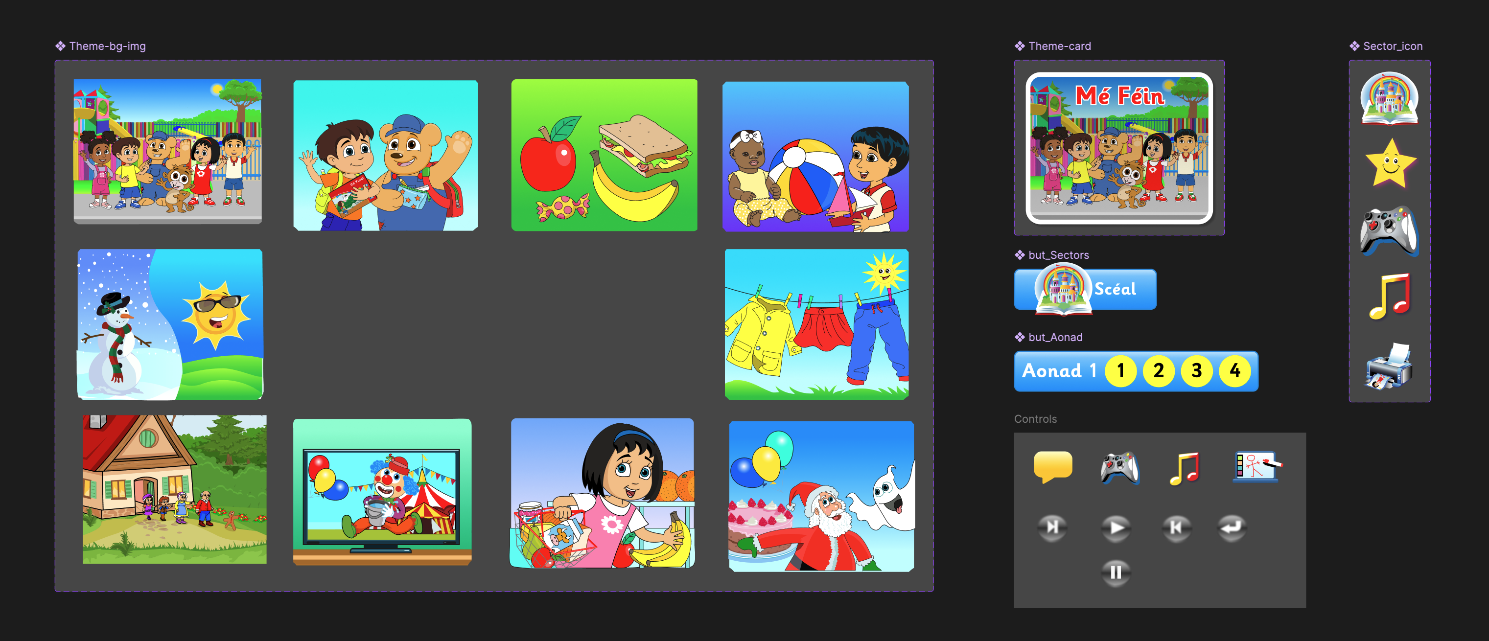
UI Design System (Figma)
I designed a complete, scalable component library in Figma:
- Buttons, menus, dialogue boxes, and layout patterns
- Responsive components aligned with the 4:3 IWB format
- Bright, open color palettes tested against children's cognitive responses
- Accessibility-first approach (contrast, readability, clear iconography)
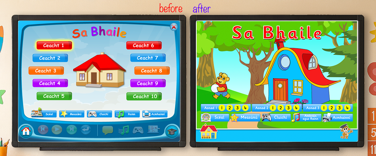
Visual Language Shift
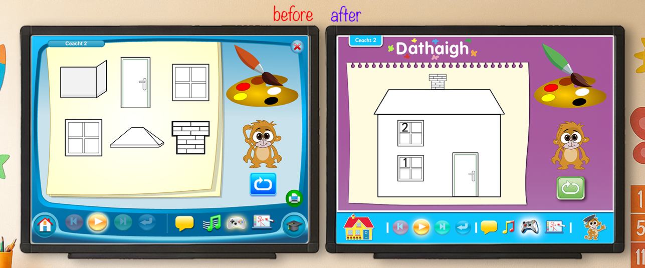
- Before: Static, software-like menus with CRT TV frames
- After: Game-inspired cards with bold visuals, Netflix-style navigation, and full-screen thematic backgrounds
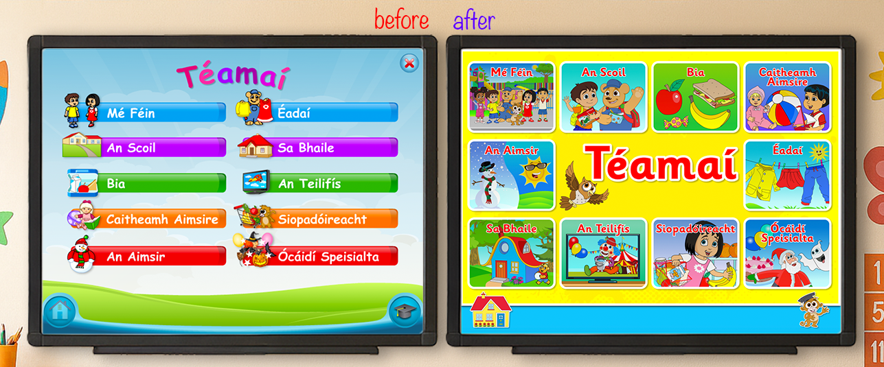
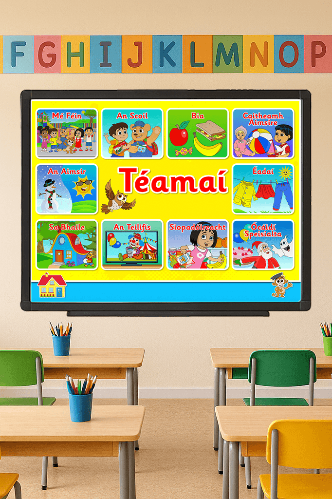
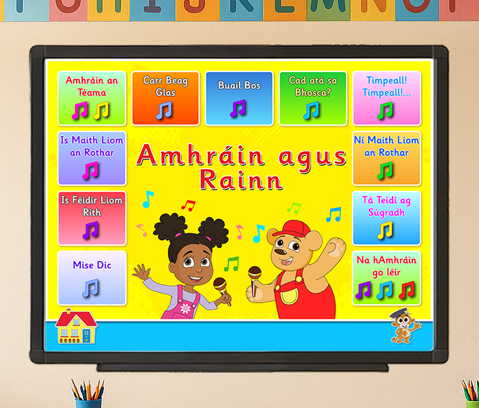
Key Decision: For the Theme Chapters screen, next image, we moved the menu to the bottom to unlock full-screen space for background art. This gave children a stronger visual connection to each theme, as the main illustration returned in later animations and games. The landing icon also reflects the full-screen visual, reinforcing recognition and excitement.
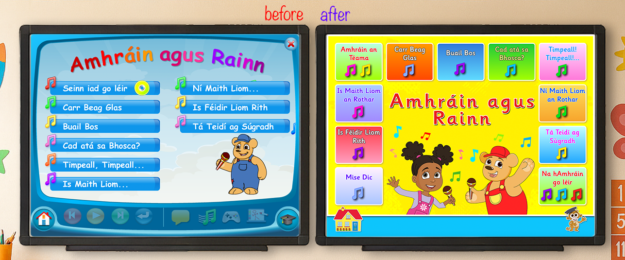
Dynamic Color System (Songs Library)
Stakeholders wanted every song card to have a different background color — manually creating each variation would've been absurd. I built a randomized color palette system in code that assigns unique colors to each card from a predefined, stakeholder-approved palette. This maintained visual variety while keeping production scalable.
CSS Snippets
.box-color-dark-green {
  background: #1eca3a;
  background: linear-gradient(180deg, #1eca3a 0%, #a3fe01 100%);
  color: #fff27b;
  text-shadow: 1px 0 0 #313131, 0 1px 0 #313131, -1px 0 0 #313131,
    0 -1px 0 #313131;
}
.box-color-orange {
  background: #fedf5b;
  background: linear-gradient(180deg, #fedf5b 0%, #f7a42c 100%);
  color: #005cff;
  text-shadow: 1px 0 0 white, 0 1px 0 white, -1px 0 0 white, 0 -1px 0 white;
}
and much more...
Unused Concepts: Some buttons I designed didn't make it into the final product because the physical books had already started printing with older button designs. This taught me the importance of aligning design timelines with print production schedules.

3. Technical Implementation & Process Optimization (Develop)
Code Refactor
I conducted a full review of the legacy codebase and implemented:
- Removed inline styles and outdated commented code
- Consolidated CSS into modular, reusable stylesheets
- Unified repeated structures (e.g., subtitle styles across video sections became a single class)
- Optimized SVG assets for cross-device compatibility
Workflow Transformation
I rebuilt the entire production pipeline:
Before:
- Files managed via Dropbox + FTP
- Game scripts manually split from Word documents
- No task visibility or performance tracking
- Developers worked blindly, duplicating effort
After:
- Migrated to Git for version control
- Implemented Jira for task assignment and tracking
- Developers could self-assign games and track their own performance
- Clear visibility into who was faster, who made errors, and where bottlenecks existed
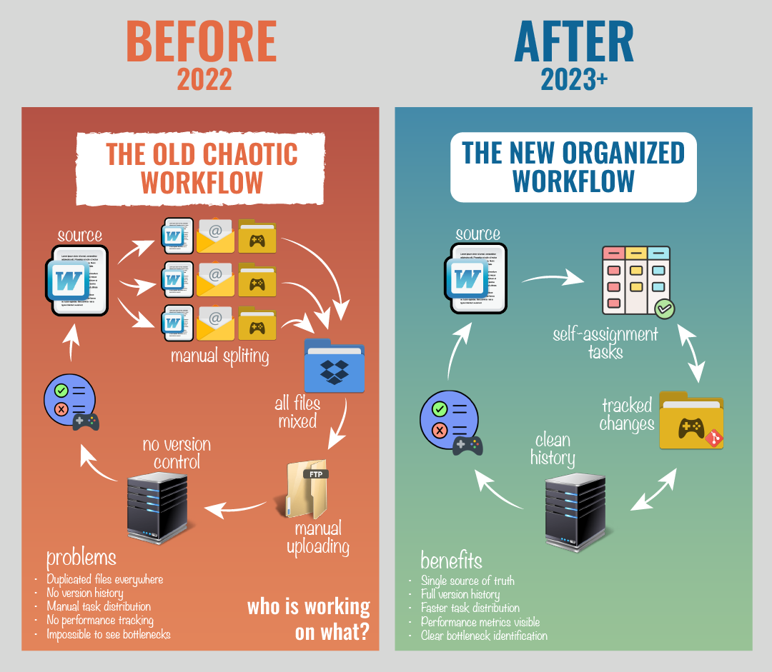
This transformation allowed me to reduce the team from 4 to 2 developers, including myself, while dramatically increasing output.
4. Validation & Iteration (Test)
Testing in Production
Because we couldn't access students directly, validation happened through:
- Teacher-testers using the platform in real classrooms
- Customer service feedback comparing old (CD) vs. new (HTML5) issues
- Market reception after launch
Iterative Refinement:
- We tested games, animations, and the interface simultaneously during production for Bua A
- Bugs and usability issues were fixed in real-time via the web server (a massive improvement over CD-based distribution)
- Post-launch issues (mostly Chrome updates) could be resolved instantly with near-zero friction
Key Design Decisions
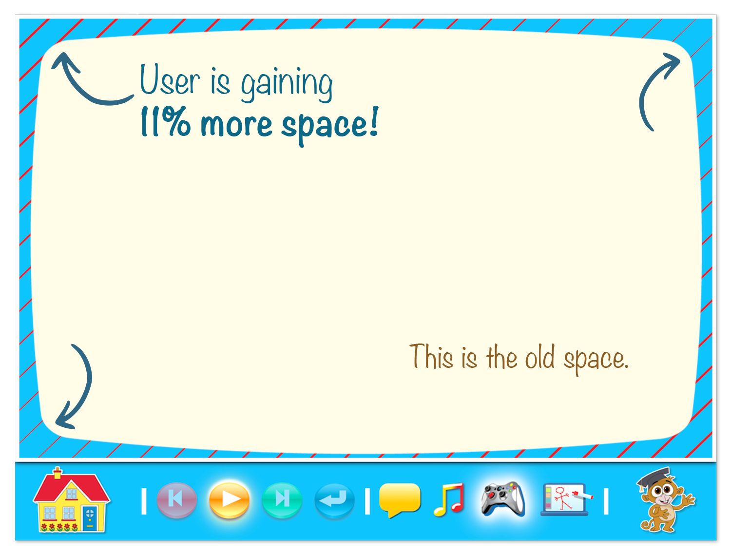
1. Removing the TV Frame (+11% Usable Space)
By eliminating the decorative CRT border, we gained 11% more usable content area within the same 4:3 dimensions. This allowed us to:
- Keep original game titles instead of truncating them
- Add proper breathing room to crowded layouts
- Create a more immersive, less cluttered experience
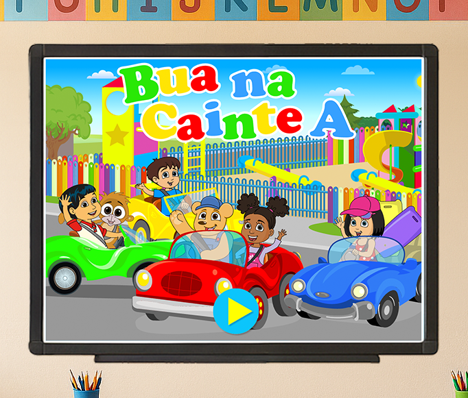
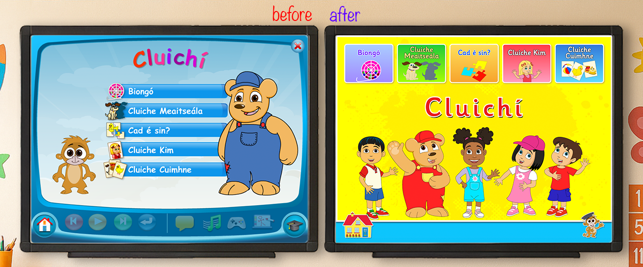
2. Playstation-Inspired Landing Page
The original landing page felt like a software menu. I redesigned it as a game-inspired world with bold visuals, larger interactive cards, and cleaner framing — making it feel like entering a fun, playful environment rather than launching a tool.
3. Thematic Visual Continuity
For the Theme Review screen, I introduced larger, colorful game icons placed in vibrant boxes, each assigned a randomized color from a predefined palette. To celebrate progress, all main characters appear above the game grid — cheering students on as they reach the end of the theme.
4. Celebrating with Characters (Songs Library)
The songs library uses the same randomized color system, but with an added layer of delight: two main characters are shown singing at the bottom center, with animated music notes floating across the screen to celebrate the students' progress.
Final Solution
The redesigned Bua na Cainte HTML5 suite delivers:
- A modern, scalable design system built in Figma and implemented in clean, modular HTML/CSS
- A game-inspired interface that feels like Netflix or PlayStation — inviting and playful, not tool-like
- 11% more usable screen space without changing hardware requirements
- Full thematic continuity — background art, characters, and icons reinforce recognition and excitement
- Real-time updates via web delivery, eliminating CD distribution issues
- Streamlined production workflow powered by Git and Jira
Impact
Production Efficiency
- Reduced game delivery time by 81%: From 8 days to 2 days for 15 games
- Cut dev team size in half: From 4 people to 2, thanks to shared codebase and reusable templates
- Reduced game production time by 75%: Individual games went from 2 hours to 30 minutes
- Slashed revision cycles by 50–67%: From 6–7 versions to a maximum of 3 (most approved on first version)
User Experience & Market Success
- Zero CD-related support issues with new HTML5 version (customer service confirmed old CD versions caused constant problems)
- Positive market reception: Despite reusing much of the content, the refreshed visuals made Bua A feel like a new product
- Real-time bug fixes: Post-launch issues (mostly Chrome updates) resolved instantly via server-side updates — near-zero friction
- Scalability unlocked: The bottleneck shifted from production capacity to waiting on content from authors
Business Outcome
The HTML5 redesign was so successful that Edco decided to rebrand the entire suite under the same name, positioning it as an updated, improved product with a 90% new interface for all future releases (2023 onward).
What I Learned
1. Smart Work Beats Hard Work
By identifying bottlenecks early (Dropbox/FTP, manual Word docs, duplicated code), I transformed the workflow before scaling design. Process optimization delivered more impact than adding headcount.
2. Design for Constraints, Not Around Them
The 4:3 IWB format, print-aligned UI, and mid-production rebrand forced me to think modularly. The design system I built was flexible enough to adapt without breaking existing work.
3. Bridge the Gap Between Stakeholders and Developers
Acting as a translator between technical and non-technical teams protected developer time and built trust. By identifying solutions before assigning tasks, I kept the team focused on execution, not troubleshooting unclear requirements.
4. Colors Communicate Differently to Children
I learned to avoid muted tones (pale orange reads as white to kids) and embrace bright, open colors. This small detail had a massive impact on usability and emotional response.
5. Iterative Validation in Production is Powerful
Without direct user access, we relied on real-world usage data from teachers and customer service. Testing in production (via the web) allowed us to iterate faster than we ever could with CDs.
Learn More
You aways could get more information at buanacainte.ie.
Portfolio Note:
This project showcases my ability to lead cross-functional design and development efforts, optimize production workflows, and deliver measurable business impact through strategic design systems and process innovation. It's a prime example of how thoughtful design, technical implementation, and smart work can transform a legacy product into a modern, scalable educational tool.