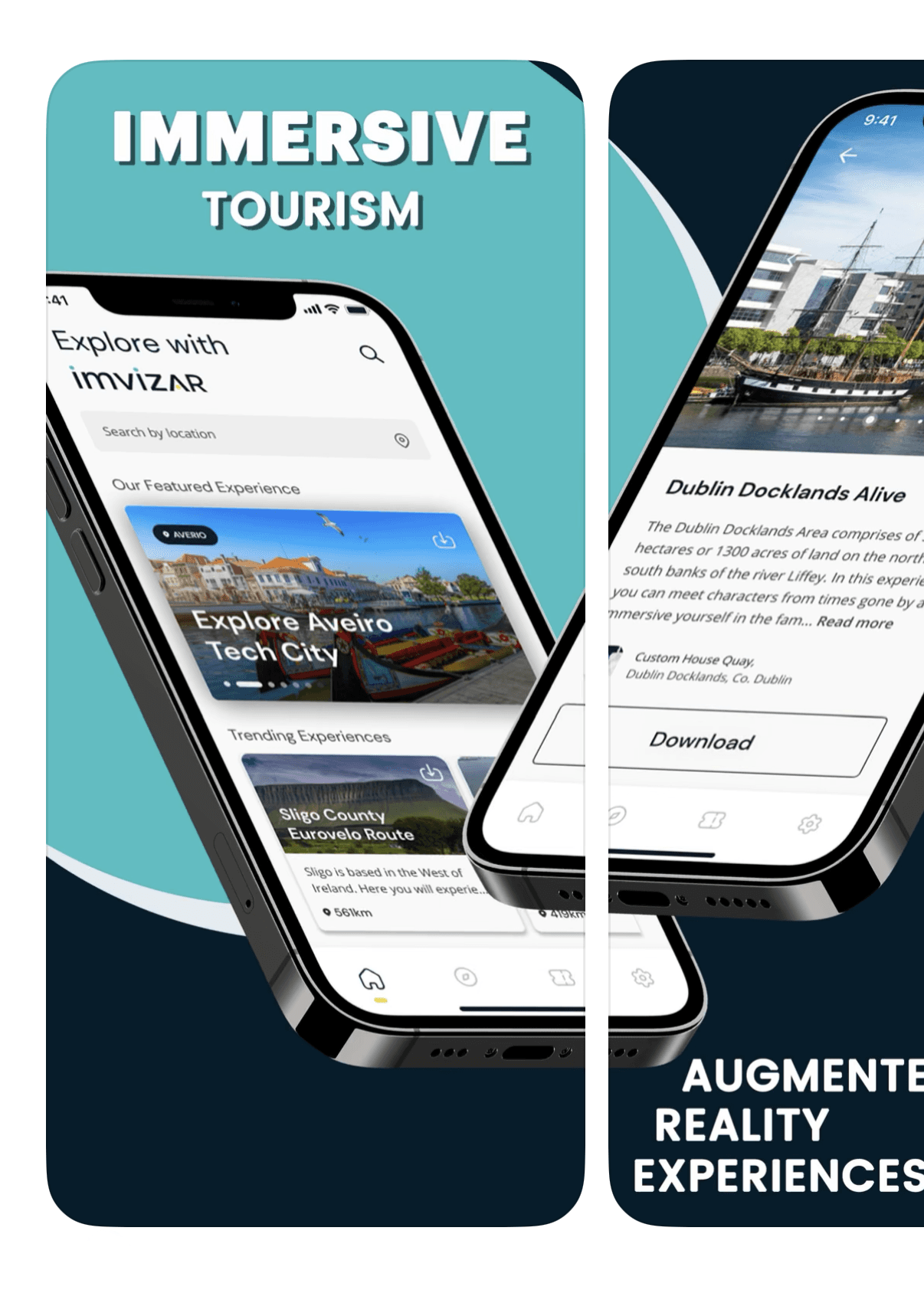
Overview
As the sole designer for an early-stage AR startup fighting for survival, I led a complete brand and product transformation in 4 months—redesigning the logo, website, mobile app, and creating a scalable design system—while embedding with the development team to ensure implementation quality. The cohesive brand identity and improved UX directly contributed to securing new partnerships and investment, enabling the company to move from "3 months of runway" to sustained growth.
Timeline: Jan 2022 - Apr 2022 (4 months)
Role: Contract Product Designer (End-to-End Ownership)
Team: 2 Developers, 1 3D Modeler/Animator, 1 Founder, 1 Marketing Lead (all remote)
The Problem & Business Context

The Challenge
Imvizar had a groundbreaking AR technology but was hemorrhaging credibility. Their branding was disconnected—logo, website, and app felt like separate products. With only 3 months of runway remaining and actively pitching to investors and enterprise clients, they needed a designer who could move fast, think strategically, and deliver a unified brand identity that signaled professionalism and innovation.
The core problems:
- Fractured brand identity: Logo, website, and app UI had no visual connection, undermining trust with potential partners and investors
- Incomplete MVP app: The app existed only as a beta with a partial Figma file (no component system or user flows). Test users struggled with core AR features; interfaces felt dated and unclear
- Stalled business growth: Competing for partnerships and funding with a brand that didn't match the quality of their technology
Critical Constraints
- Time pressure: 3 months of funding left for design work (development contract extended slightly longer)
- Lean team: No dedicated researchers, no PM—just 5 people wearing multiple hats
- Technical complexity: Design had to work within Unity3D's limitations for AR experiences
- No room for failure: Every design decision had to support immediate business goals (client acquisition, investor pitches)
Goals & Success Criteria
Business Goals:
- Secure new partnerships and funding by presenting a cohesive, professional brand
- Enable faster client prospecting with a modern, credible website
User Experience Goals:
- Create intuitive AR interactions by learning from proven solutions (Pokémon GO)
- Ensure design consistency across all touchpoints (web, mobile, branded materials)
Design System Goals:
- Build a scalable component library to support rapid feature development post-launch
My Role & Collaboration
I was hired as a design-developer hybrid with full ownership of:
- Brand identity redesign (logo, color system, visual language)
- Website redesign and implementation (using Webflow)
- Mobile app UX/UI redesign and design system creation
- Collaboration with Unity3D developers to ensure accurate implementation
Cross-functional collaboration:
- Founder & Marketing Lead: Brought field research and user feedback from client demos; I translated insights into design iterations
- Developers (2): I worked directly in Unity3D to export UI assets from Figma, troubleshoot implementation issues, and ensure fidelity
- 3D Modeler/Animator: Coordinated on asset handoffs and AR interaction flows
Process & Design Logic
1. Research & Strategic Direction (Week 1)
Competitive Analysis:
I studied successful AR apps—primarily Pokémon GO—to understand how they solved real-world AR UX challenges:
- How do users understand spatial anchoring?
- What visual cues guide interaction in mixed reality?
- How do we communicate system limitations (e.g., poor lighting, lost tracking)?
Stakeholder Insights:
The founder and marketing lead conducted field tests with potential clients. I synthesized their feedback into design principles:
- Simplicity over features: Users needed immediate clarity, not complexity
- Trust through transparency: Show what the AR system "sees" and why
- Digital-forward aesthetic: Signal innovation through modern colors and clean interfaces
2. Brand Identity Redesign (Week 1-2)
The Logo:
The existing logo (three disconnected triangles) had no connection to AR or vision. I redesigned it as a "magic eye"—an abstract lens/iris that symbolizes augmented vision.
Color System:
Introduced a digital-forward palette (electric green + cyan blue) to signal innovation and differentiate from competitors using warmer, earth-tone palettes.
Outcome:
The new identity was instantly recognizable and better positioned Imvizar as a cutting-edge tech company.
![]()
3. Website Redesign & Rapid Deployment (Week 2-4)
Strategic Priority:
The website had to launch immediately to support ongoing client pitches. Fortunately, they were already using Webflow, so I could work directly from their existing site—adding new features, applying the rebrand, reorganizing sections, and fixing critical issues.
Process:
- Rebranding integration: Applied the new color system (electric green + cyan blue), updated typography, and replaced the old logo across all pages
- Spacing & consistency: Fixed serious mobile text wrapping issues and standardized spacing throughout the site to create visual rhythm
- New sections: Added an Awards section to build credibility and reorganized the feature boxes to clearly communicate value
- Iterative improvements: Published incremental updates weekly so the team could share improved materials with prospects immediately
- Delivered the final site in 4 weeks, allowing the team to say: "The app is coming soon—see our new brand."
Impact:
The professional website became a key sales tool, directly supporting investor conversations and client onboarding.
Website Before/After Breakdown
Image 1: Hero Section - Setting the Stage for AR

Before: The old hero section was entirely white with no contrast—just black text floating over gray and yellow blobs. There was no clear visual hierarchy, and nothing communicated "augmented reality" or "immersive experiences."
After: I completely transformed the hero by introducing a high-contrast design: a clean white navigation bar sits above a dramatic dark hero image showing a real person using their phone to interact with an AR experience in a historic city. While you can't see the app interface or the AR interaction itself, the image immediately communicates the product's value—exploring real places through immersive technology. The strong contrast between the white nav and the dark hero draws the eye directly to the tagline and the call-to-action: download the app.
Image 2: Features Section - Fixing Information Hierarchy

Before: The "What We Do" section had two feature boxes describing AR Experiences and Tourism Platform. However, there was a critical text wrapping bug—copy was leaking outside the boxes, making the content unreadable and unprofessional.
After: I restructured this entire section, starting by adding a new Awards section above the features to immediately build credibility with visitors. For the feature boxes, I fixed the text wrapping, applied the new brand colors (dark navy backgrounds with cyan accents), and created clear visual hierarchy. Each box now uses rounded corners and proper spacing, making the information scannable and trustworthy. The cyan borders reinforce the brand while guiding the eye through the content.
Image 3: Content Spacing - The Details Matter

Before: Spacing was inconsistent throughout the site. In this testimonial section, the top spacing was noticeably smaller than the bottom spacing, creating visual imbalance. The quote also lacked emphasis.
After: I standardized all vertical spacing to create rhythm and balance—top and bottom margins are now equal. I also italicized the quote to simulate someone speaking, adding a human touch to the testimonial. These small details compound across the entire site, making the experience feel polished and intentional rather than rushed.
Image 4: Contact CTA - Brand Consistency Across Touchpoints

Before: The contact section sat on a plain light gray background with yellow CTAs that didn't match the new brand identity. The design felt disconnected from the rest of the site.
After: I applied the signature cyan blue brand color as the section background, maintaining the site's contrast rhythm (alternating light and dark sections). The CTA button was redesigned with squared corners and subtle rounding—matching the button style used in the mobile app—to create consistency across all touchpoints. This attention to detail ensures users experience a cohesive brand whether they're browsing the website or using the app.
Design System Thinking:
Every decision on the website—spacing, button styles, color application, typography hierarchy—was intentionally aligned with the mobile app design system I was building in parallel. This meant when users moved from web to app (or vice versa), the experience felt familiar and trustworthy. Consistency builds confidence, especially for an early-stage startup fighting for credibility.
4. Mobile App Redesign & Design System (Month 2-4)
The Challenge:
The app existed as a beta MVP with a partially completed Figma file—no component system, no defined user flows, just scattered screens and illustrations. My job was to:
- Finish the incomplete design and create a scalable component library
- Build proper user flows for core AR experiences
- Transform existing illustrations into reusable UI components
- Make design adjustments to improve usability based on test user feedback
- Export production-ready assets for Unity3D implementation
Design System Creation:
I built a comprehensive component library in Figma from scratch, covering:
- UI controls (buttons, modals, input fields, navigation patterns)
- AR-specific patterns (spatial anchors, tracking indicators, error states, permission flows)
- Color, typography, and spacing tokens aligned with the new brand
- Illustration-based components converted from static assets into flexible UI elements
Unity3D Integration:
I exported assets directly from Figma into Unity3D, worked with developers to ensure pixel-perfect implementation, and iterated based on in-engine testing. This hands-on collaboration ensured the design system translated accurately from static mockups to interactive AR experiences.
Key UX Decisions:
- Clear spatial feedback: Used visual rings and grid overlays to show where AR objects would anchor in the real world
- Graceful error handling: Designed friendly messages for common AR failures (e.g., "Move to a well-lit area" instead of technical error codes)
- Consistent branding: Every screen reinforced the "magic eye" identity through color, iconography, and motion
- Design-to-app alignment: All UI patterns (button styles, spacing, typography) matched the website redesign to create a unified cross-platform experience
Additional Experiences (Month 4):
I was asked to stay one extra month to design interfaces for two new AR experiences, extending the design system to support diverse use cases and proving its scalability.
5. Field Testing & Iteration
The team conducted continuous field tests with real users. I incorporated feedback into weekly design sprints, prioritizing changes that:
- Reduced onboarding friction
- Improved AR feature discoverability
- Enhanced trust through clearer communication of system capabilities
Key Design Decisions
Decision 1: Prioritize Speed Without Sacrificing Quality
Why: With only 3 months of funding, I couldn't afford lengthy research phases. I relied on competitive benchmarking (Pokémon GO) and stakeholder-driven feedback to make informed decisions quickly.
Outcome: Delivered a cohesive brand and app redesign in 4 months without sacrificing UX quality.
Decision 2: Build in Public (Website First)
Why: The website could launch immediately and provide business value while the app was still in development.
Outcome: The team had a professional brand presence for investor and client meetings within 4 weeks, accelerating partnership discussions.
Decision 3: Embed with Developers in Unity3D
Why: AR apps have unique implementation constraints (performance, spatial rendering). I needed to understand technical limitations firsthand to design feasible solutions.
Outcome: Reduced back-and-forth with developers, ensured high implementation fidelity, and built a design system that scaled beyond my contract.
Final Solution
Deliverables:
- New brand identity (logo, color system, typography guidelines)
- Fully redesigned website (built in Webflow, live in 4 weeks)
- Mobile app redesign with comprehensive design system (Figma → Unity3D)
- UI interfaces for 2 additional AR experiences
Design System Longevity:
The component library I created is still in use today (2025), supporting new features and experiences without requiring full redesigns.
Impact & Results
Business Outcomes
- Secured new partnerships and investment: The cohesive brand directly supported successful investor pitches, extending the company's runway and enabling growth
- Enabled rapid client prospecting: The new website became a key sales tool, reducing friction in early-stage conversations
- Long-term scalability: The design system continues to power new AR experiences 3+ years later, demonstrating sustainable design infrastructure
User Experience Improvements
- Improved AR feature clarity: Field testing showed users understood spatial anchoring and tracking feedback more quickly than with the old UI
- Brand consistency: Users and stakeholders noted the "professional" and "cohesive" feel across all touchpoints
Recognition
- Imvizar has since won multiple industry awards and continues to grow, still using the brand identity and 90% of the design system I created in 2022
What I Learned
1. Speed + Strategy > Perfection
In a startup with 3 months of runway, waiting for perfect research is a luxury. I learned to make confident, informed decisions using competitive benchmarks and rapid iteration, proving that strategic design can move fast without sacrificing quality.
2. Business Impact is the Metric That Matters
This project taught me to think beyond "good UX" and focus relentlessly on business outcomes. Every design decision had to answer: Will this help us secure funding, win clients, or reduce development time?
3. Design Systems Are Investments, Not Deliverables
Building a scalable design system in month 2 (rather than waiting until the end) allowed the company to continue innovating long after I left. This reinforced my belief that good product design is about enabling future growth, not just solving immediate problems.
4. Collaboration with Developers Unlocks Better Design
By embedding with the Unity3D team and learning the technical constraints firsthand, I designed solutions that were both beautiful and feasible. This hybrid approach (designer + developer mindset) has become a core strength in my practice.